Pages

Filming of the Narrative 29/11/12 (Josh)

Yesterday we went and filmed the narrative parts of the music video. This was a long day for all involved with us starting at 10:30 and not finishing until 19:00. We had a number of different locations which we needed to shoot in and wanted to make sure that we wouldn't have to re-film any sections so we took lots of footage.

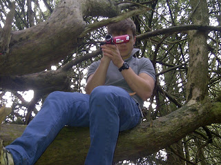
Here is a photo of jonny at the first location capturing soem footage from the point of view that the main singer would have. This will be used in the early part of the song. Jonny made sure that he held the camera steady whilst taking this shot so that the video is of the highest quality.


Here Jonny is explaining to Mike what he needs to do for the next scene. We made sure we done this before every single scene that we filmed so as the actors would have 100% confidence that they knew what to do. This meant that the filming would not take to long and would be efficent for all involved and wouldn't mean that the actors would have to film each scene to many times.
 Here Ami (the girl in the narrative) and Mike are about to start acting one of the scenes and are just recieving a final brief on what they will need to do from myself and Jonny. This is another part of the film which will go during the part of the film where the main singer (Mike) is imagining that they are in a relationship.
Mike and Ami mid scene, this is another part of the footage for when the lead singer is imagining they are in a relationship. Mike and Ami were confident that they knew what they were doing and done a fantastic job of this scene. This was ine scene that we filmed not sure weather or not we would use it but after we had filmed it we decided that we would definately be using it as it look great.


To conclude this was a really enjoyable day for all involved and was very constructive for Jonny and myself. We managed to get all of the footage that we need for the film and hope to have it completely edited by the end of November.

Organizing our filming schedule with the use of Social Media (Jonny)


Before commencing our filming for our music video Josh and I had the complicated task of organizing our filming schedule. This may not seem like a complicated task, however logistically finding a day where we could use our chosen location or green screen and where all 3 of our band members were available was never going to be easy!  Because of this, we decided to take our filming schedule in to the 21st century and create our own Facebook event where we could co-ordinate days with our band and actress and find dates that were mutually convenient for everyone!

We invited our 3 band members and our actress for the narrative to the event. We uploaded images of the original 'village musicians' so our band could get an idea of the style, along with this we also uploaded our animatic to help explain to the group the structure and story line of our music video.

When we needed to film a scene we would 'tag' whoever was needed in a post along with what we needed to film and where it would be filmed. Those who were 'tagged' in the post could then post a comment telling us what dates and times they were available, allowing us to co-ordinate a date that everyone was available. This process was very simple and saved a lot of time. It was a excellent example of how social media can connect people, as if we had not created an event we would have been left with the tedious task of phoning each member individually and collating the dates that everyone could do, before phoning back all of the members to tell them the date we had decided. The event page also allowed us to inform the group of any plans for the filming, for example, where we would meet, what they would need to wear etc..

Along with making life easier for ourselves, using social media also allowed to us to add another technology to the ever growing list that we have used in this A2 course. 


Prop List (josh)

There are a number of props that we will be needing for our video, these will be essential in ensuring that the video will be successful and have the professional look that we intend to have once we have finished it. Through planning in advance the actors that we will be using will know what they need to bring. It also means that we will know what we will need to bring for the actors.

The props required are as follows:
Guitar for all scenes mike will be in
Drum kit for the performance scenes
Key board for the performance scenes
Coke can for the scene outside the shop
Mike clothes: white T-shirt, jacket and jeans
Nicky clothes: blue jumper and jeans
Tom clothes: Jeans, two jackets
Ami clothes: a number of different outfits so that it doesn't look like it was all filmed at the same time

Nine Frame Analysis (JOSH)

I am going to analyse the music video for the Noah and the Whale song 5 years time. I have chosen to do this particular video because they are from a similar music genre to our band as well as having used some the techniques that we intend to use for our music video.

 Firstly in the opening few seconds of the music video there is stop motion which is used to introduce both the band and the song which is an idea which we particularly liked as it is a reasonably unused method of making sure that the  audience definitely knows the name of the song and the name of the artists. This means that the audience is much more likely to buy the song as they won't have to go the effort of finding out the name of the artist from an outside agent e.g. an app on their smart phone.

Second the music video has close ups of the ukulele when this instrument is being played which means that the images are cohesive to the audio. Without this it is possible that the audience my get confused and not understand the meaning behind the video.

In a later frame there is an image of a chicken which adds some irony and humour to the video without having being too cheesy as it is unexpected for there to be a chicken at a zoo. This isn't something that is done for the entirety of video as this could mean that the video looks unprofessional.

The whole of the video appears to have been filmed in a low quality camera which adds authenticity to the video and is yet another way that video has some uniqueness to it without being to wild and rubbish thus creating a poor viewing experience for the audience.

We also liked the way that in the chorus when the words " Fun, Fun, Fun" were said these lyrics appeared on the screen along with some actions which appear to show some dancers having fun. This is one technique that we will be considering for our video as it is one way of complying with Andrew Goodwin's rules that is reasonably easy to do.

Sixth is an example of another techniques that we intend to use, close ups of instruments. This means that the audience will be able to create a cover of the song easier if they wish to as they will know exactly what instruments are being used.

At 2:56 there is a shot of some characters within the video creating a square with their feet, this is one shot that is especially effective as it shows clearly what the shot is intended to show. If this shot had been done with a long shot from a tripod it would have been impossible for the artist to covey entirely what they want to.

3:23 shows the band performing all together which is one of the conventions of most music videos and is something that as we know from our research is something that audiences have come to expect from a typical music video.

Performance Green Screen Filming 17/10/12 (Jonny)

This was our first filming day on our new music video project and despite a few set backs it went really well! We had chosen to film on Wednesday after school as all of our band members were free, along with the class room and the green screen. We borrowed the drum set and the keyboard from the music department and Mike (the guitarist) brought his own guitar. We filmed each member of the band independently with their instrument first filming a standard full shot of them playing the full song. We then filmed them a second time with a number of different close ups and angled shots. One of the main problems we
encountered during this process was that the band struggled to listen to the song being played over the top, this was especially a problem for our drummer Nicky. We overcame this problem by having him discreetly wear some in ear headphones connected to my phone which played the song straight in to his ear. This allowed his drumming to be in sync with the actual song.
After we had filmed each band member individually we then proceeded to film the band as a whole. Although we only intend to use them in the chorus, we made the decision to film them playing
the whole song as a contingency plan for any changes made along the way. When filming the whole band, we struggled to fit everyone on the green screen without peoples heads and arms coming off the screen. Josh and I were able to solve this problem
by strategically placing instruments so that all members could fit.
 Although this does block the view of the drums slightly, we felt that this was the most effective way of fitting the whole band in shot. Following this we took some shots of the band members without instruments 'messing' around and being silly as we felt this would be effective to go in along the chorus with other footage of them actually playing the song. Although a fair amount of our film looked quite stage, we did manage to get a few moments where the acting looked genuine and where they all managed to fit on the green screen.


Over all, I feel that Filming went well and that we achieved to get footage of everything we needed. We have looked through the tape, but are still to edit it, so we hope to avoid any major problems there. At times it was difficult to get the whole band
 to co operate simultaneously and film the footage which was frustrating and caused the process to drag out longer than we needed. However it was important to keep our band members happy throughout the process, after all they were the ones doing us a favor. Josh and I enjoyed the experience of directing and filming the performance with the green screen and had good fun with the band. We felt that this was a really good first filming session and hope that filming sessions in the future are this productive! Are next planned footage to film is the majority of the narrative which will involve us filming off location (date tbc).
We are looking forward to this greatly!  

Still Frame Analysis (Jonny)

I have looked at examples from three bands in a similar genre and format (3/4 male performers) too the village musicians. I have taken some still frames from a selection of music videos they have produced and analysed these. This will help us when planning and story boarding items such as band performance and narration. 
2 Door Cinema Club

Full Band Shots
These are still frames that have been taken of the full band performing their song during the music video. A clear similarity between them is that the lead of the band (which in this case are all singers) always stands in the middle, flanked either side by background instruments/ vocals. The still frame of Noah and the Whale and of Mumford and Sons  involve the band playing in very
Noah and the Whale
'set up' locations which add effect to the genre of the song
(This coincides with goodwins rule that the visuals in the video 
will relate, amplify or contradict the lyrics of the song). In contrast 
2 door cinema club are playing behind a very simple white back
drop. I believe they have chosen this because of the bands ethos
of it being 'all about the music' therefore they want the audience
Mumford and Sons
to concentrate on the music being played and not the backdrop or location. I like the idea of playing behind a block colour background as it gives emphasis on the band characters with what they are wearing and especially the music that they are playing.
I think it would be very effective to have our band behind a 
block coloured screen in parts of the video when they are 
performing.


Instruments Being Played


I have taken some still frames which show a variety of shots and angles that are used when focusing on a particular instrument being played. In these cases the instrument being focused on is often the prominent sound in the music video at that time. I think that the first two examples given are really effective as they clearly show the instrument being played with a clear view of the hands and the instrument. The third example shows a full shot at eye level of the drummer in Noah and the Whale. Although it is a full shot he is the only band member in the shot. This is good at isolating each band member and representing them individually as the shot can look too clustered if all band members are squashed in to it.

 Lead Band Member


I have taken a still frame of each bands lead member from the same music video as the group stills. These stills focus on the lead band member on their own. I have purposefully chosen a mid-shot, close up and long shot in order to compare the effectiveness of each. Firstly the mid shot of the lead from 2 door cinema club. In this still frame he is placed behind a white back drop with the mid shot allowing the viewer to see his face and the top half of what he is wearing. This is an important shot as by including what the lead is wearing helps represent the Indie image that the band represents. The emphasis in this shot is image. The second still frame is a close up of the lead from Mumford and Sons. This still frame focuses solely on the lead, this shot is taken whilst he is singing so is likely to relate to the song being sung in the music video. The emphasis in this shot is performance. The final still frame is a long shot of the lead from Noah and the Whale. This still frame focuses both on the lead playing his instrument and his surroundings. This shot can amplify both the lyrics and the sound if the surroundings relate to the lyrics of the song. The emphasis
on this shot is both performance and image.


Narrative

I have included a variety of narrative still frames, one from each of the bands. I have chosen still frames which I think may promote inspiration towards our own music video. The first still frame is the introduction to Noah and the Whales music video. I like the use of a title as it is rare to use one when creating a music video. This title adds to the nostalgia of the video which is produced as if it were a home movie. This is similar to the concept we are hoping to create when producing our video and therefore, in our case, using a title may be effective. The second still frame is from a Mumford and Sons music video, it entails a boy and a girl sitting together on a car bonnet. I have chosen this frame as the use of a long shot looking in to the sun set helps set a good image of relationship, but more importantly would amplify the lyrics of our own song. This would allow us to use another one of Goodwin's rules. Finally, I have taken a still frame from a music video by Two Door Cinema Club. This still frame has given me some ideas on how we could represent sadness and emotion.
The high camera angle which is often used to make the character on screen big and powerful is effective in this case by giving the illusion that the character is unaware that he is being watched whilst he sulks looking out the window. It would be good to use this angle towards the end of our music video when we want to portray a sad emotion.    


You Tube Clips Relating To Our Genre (Jonny)


We found this video on Youtube about the diferent styles of music video and found it really useful in helping us to choose the right music video genre for the Village Musicians. The video was posted by videomaker which is a group of film producers which post videos to help people create their own films and music videos. 


After watching the video we then proceeded to view the village musicians promotional video which helped give us a greater insight in to the band and how they present themselves as a group (this was an important factor in helping us to decide what style of music video we would use.) From watching the promo video we have decided to rule out dance genre as we feel that this does not fit in with the image of our band. We also felt that although browser looked really effective, our capabilitys could not stretch to this use of music video genre. Watching this video helped us understand that performance in our music video was really important for promoting our up and coming band. Close ups of the band members playing their music will help promote their image to our target audience and will increase public awareness of our band. We have also chosen to include a story (narrative) in our music video as the examples given of 'Daughtry- Its Not Over' showed us that we could add emphasis to the lyrics of our song through effective narration. With in our narration, we would also like to experiment with animation. At the moment, we think that 10 or so seconds of stop motion could add effect to the music video. Although this is not always the norm in a music video, we would love to challenge ourselves by showing a wide range of film production techniques. We also feel that the stop motion will draw greater attention from the audience in the first 10-15 seconds of the music video. 

Using You Tube as a means of determining the genre of our music video has been simple and very effective and has also allowed us to use ANOTHER form of technology as part of our Research Evidence.

All This Time by the Village Musicians

Record company name/profile logo (Jonny)

Record Company Names
These are our initial designs for our Record Company name. I have designed them by hand and scanned them on to the computer. I have used the same name as this has already been decided however made variations to the font. Once we decide which font to use we will incorporate this in to our chosen logo.
I have used a block grey colour for this design edged with a black line. The font is elegant as if it was hand written. I feel that this font represents our Record company as stylish and modern which would reflect our first record signing of the village musicians.  


I designed this font in thick block lettering and filled it in red again with a black outline. This font is bold and would stand out in a crowd. This font represents fun and youthfulness which again would coincide with our first signing of the village musicians. 

Designing this font I was inspired by our Blog Title and Text font which is an ice blue in an electrocution font. This design represents quirkiness and originality as well as excitement from the vivid colour. This would relate with the village musicians as they present themselves as a quirky/ indie band.


Record Company Logos
These are our initial designs for our record company logos. We decided that we wanted something that was unusual (so to stand out) but which had some relation to music. We designed these logos with the intention of placing the record company name either above/ below or on top of the company logo. 


My first design was an image with a straight forward representation to who we were. As a record company, what better logo to have then an old fashioned RECORD! I redesigned the image to add a bit of colour to allow the logo to stand out from the crowd. With this design I would put the name of the record company along the outside of the record.  


My second design was inspired by images of the the ancient Greek temples. Although this does not relate to music as much as bongos or a record does, I believe that it would help establish our brand by having an unusual image. After all when Virgin Records began in the 1970's their first logo was very obscure and did not directly relate to music, yet the record company became very popular! For this design I would place the record company name on the top and bottom of the logo.
My final design was based around a set of bongos I had on the windowsill of my room. Although this is a very simple image I felt that it could clearly represent a record company through the relation as a musical instrument. Also bongos are an unusual instrument to use to represent a record company and so has a novelty which may help people remember the brand.  


Final Design
This is our final record company logo. It incorporates our initial ideas for both the name and the logo. We chose my second initial design for the record company name. We chose this design as we felt that it was eye catching and stood out from the other designs. The colour red signifys creativity and passion which we feel is important in an industry where passion for the product (music) is vital for success. The logo design came from my first initial design of a record, this is an iconic image modernised with my choice to add a splash of red to the logo. We also felt that the record name fitted really well inside the logo, making it aesthetically pleasing to the eye. I created the final design on a simple picture editing software as I felt it made the logo look much more profesional. As the logo is now saved as an image we can place it on websites, future albums and promotional material. The logo gives our record company an identity and allows us to be one step closer to forming a powerful brand that we hope one day can become known internationally!

DVD/digipack analysis: layout, brand ident, image, text (Jonny)

Digipack A

 Single Fold Digipacks

Digipack B
These single fold digipacks are what we would most likely use to promote an up and coming band who were releasing their first album. A single fold digipack would be sufficient to place a disks worth of music inside, on most of these designs there is also enough space to place information on the band (either a booklet or leaflet) this is important as it also gives information about the band whose
 main objective is to promote themselves.
 A single fold digipack is also the 
Digipack C
Digipack D
cheapest to produce which is important to consider as new bands are likely to have a small budget to spend on production, it will also allow for the CD to be sold for a reasonable price to the consumer which increases their chance of impulse buying to see whether the band are any good.


Multi- Fold Digipacks 

Alternatively we may choose to spend more of our 
budget on the digipack production, in which case we may
Digipack E
decide to produce a multi- fold digipack which looks more impressive than the single fold and presents the band with greater professionalism. 
Digipack F
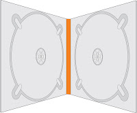
 As there is space for 2 CDs we may choose to include special features such as other songs or the music video 
with deleted features, this would also give the 
CD a USP with its special features against

buying the track online.
Digipack G
 A multi- fold digipack also allows for better
 presentation of the bands information such
Digipack H
 as with digipack E which incorporates a small book in the centre of the pack and digipack F which allows you to place small 'free-bees' inside such as stickers 
and badges (these items would also help promote the band).
Digipack I
As there are more folds there will also be more panels of the digipack which would allow us to place more images of the band on to the pack, this would help promote the bands image (which is important for a boy band) to a greater extent than the single fold digipack.


Text Designs  

Text A
Our inspiration behind the album font was simplicity. We felt this represented the village musicians in both their songs and their appearance as a group. We felt that with an album cover, sometimes less can be more especially when trying to inform your consumers about a new band. I have created some basic font designs which may help with inspiration to design our actual
Text B
album title. Texts C and D are very natural in appearance with
the theme of mud and carved wood respectively. Where as on the
other hand Texts A and B while still simple are a bit more animated
with inspiration from old fashioned story books and comics.
Text C
Each of these fonts would allow us to market the album in a different way. For example... Text B could allow us to design a comic book style image of the band on the album cover, the
theme could continue throughout the album on to the CD design
Text D
and the information booklet.


Brand Identity And Album Covers
Album 1
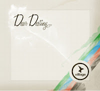
We have included some images of previous album covers
along with images we felt most suited the identity of the band
and would be well suited on a new album or on a promotional advertisement. Album 1 and 3 are examples of past album covers
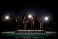
which are very similar to our simplistic text designs, both of which contain the logo of a bird in a circle (it is important that we place this logo in a prominent lace on our album as this is a large part of the brand identity). The images on Album 2 and 3 represent the band in very different lights. Album 2 represents the band as energetic and youthful- something which may have greater appeal 
to our target audience of the 13- 21 year old market. Album 4 however portrays the band as a serious and mature band which if used as a album cover may appeal to the older demographic 
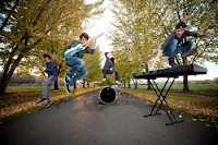
Album 2
who are interested in listening to new up and coming bands.
Obviously these images were taken by someone who had ideas that were different to ours.If we were wanting to use an image of the band for our album cover, we would use images such as these for inspiration, however ultimately, we would ask to have a new photo shoot where we could use our own creative ideas to portray the band. However as I have stated above the last two album covers did not contain images of the band and therefore we may choose to follow this theme by using a image such as the logo or maybe

even an image which relates to the album name or inter textual
links with the lyrics 
Album 4
Album 3

Lyrics

This here is a "wordle" of the lyrics to our song. This has enabled us to see which words are used the most in our song and which we should add more emphasis to whilst producing ideas for the video. We chose to use wordle as it meant that we were able to see exactly this which means that we are now able to produce the best possible music video focusing on ideas and words that we wouldn't have if we hadn't used this technology.
 

Blogger news

Sample text

Blogroll

About

Sample Text