 |
| Digipack A |
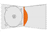
Single Fold Digipacks
 |
| Digipack B |
main objective is to promote themselves.
A single fold digipack is also the
 |
| Digipack C |
 |
| Digipack D |
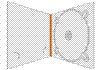
Multi- Fold Digipacks
Alternatively we may choose to spend more of our
budget on the digipack production, in which case we may
 |
| Digipack E |
decide to produce a multi- fold digipack which looks more impressive than the single fold and presents the band with greater professionalism.
 |
| Digipack F |
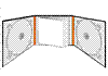
As there is space for 2 CDs we may choose to include special features such as other songs or the music video
with deleted features, this would also give the
CD a USP with its special features against
buying the track online.
 |
| Digipack G |
presentation of the bands information such
 |
| Digipack H |
and badges (these items would also help promote the band).
 |
| Digipack I |
Text Designs
 |
| Text A |
| Text B |
the theme of mud and carved wood respectively. Where as on the
other hand Texts A and B while still simple are a bit more animated
with inspiration from old fashioned story books and comics.
| Text C |
theme could continue throughout the album on to the CD design
 |
| Text D |
Brand Identity And Album Covers
 |
| Album 1 |
We have included some images of previous album covers
along with images we felt most suited the identity of the band
and would be well suited on a new album or on a promotional advertisement. Album 1 and 3 are examples of past album covers
which are very similar to our simplistic text designs, both of which contain the logo of a bird in a circle (it is important that we place this logo in a prominent lace on our album as this is a large part of the brand identity). The images on Album 2 and 3 represent the band in very different lights. Album 2 represents the band as energetic and youthful- something which may have greater appeal
to our target audience of the 13- 21 year old market. Album 4 however portrays the band as a serious and mature band which if used as a album cover may appeal to the older demographic
 |
| Album 2 |
Obviously these images were taken by someone who had ideas that were different to ours.If we were wanting to use an image of the band for our album cover, we would use images such as these for inspiration, however ultimately, we would ask to have a new photo shoot where we could use our own creative ideas to portray the band. However as I have stated above the last two album covers did not contain images of the band and therefore we may choose to follow this theme by using a image such as the logo or maybe
even an image which relates to the album name or inter textual
links with the lyrics
 |
| Album 4 |
 |
| Album 3 |


0 comments:
Post a Comment