 Firstly I am going to look at the font that is used on a DVD cover for the one direction tour DVD up all night. This DVD has three different fonts used one for the band name, another for the tour name and finally for what is actually on the DVD. The main writing on the DVD is the band name which is written in a much larger and more bold font than the rest of the text on the page. This helps to draw the attention to the name of the band and means that people that are going to buy the product are easiy able to find it. This means that we should have any writing of the band name large so that people have there attention drawn to it more easily than they would if it was the same size as the name of the tour. The name of the tour is in white making it easy to see on the black background and it also matches the colour of the band name. The final text on the page which says "The live tour" is in capitals this is so that people are fully aware that the tour was filmed in front of a live stadium audience and hasn't had anything changed on it this is important for the band so that they are able to maintain a positive image of being honest with fans.
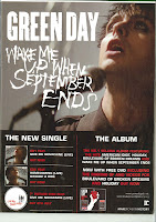
 This here is an example of a band advertisng a new album that they are about to release. Once again there are a number of different font types. This once again has the bands name written in the boldest and largest font on the page and shows that this is seen as the most important part of any publication that is advertising a band. This however has the album name in reasonablly large writting as this makes it easier for the audience know what they are looking for on itunes or other similar music websites. This is in a gothic font which fits with the genre of music that the band produces. The text at the bottom of the page is much smaller but does stick with the colour scheme that would be expected by a band of this genre.
To conclude the font that a text is written in is quite important but the most important is that the band name is the largest writing on the page so that the target audience is able to find the music when they go to a shop to buy it.


0 comments:
Post a Comment