Pages

Showing posts with label Research Evidence. Show all posts

Planning the Magazine Advert (JOSH)

This here is my planning for the magazine advert. I decided that we would keep with the idea of time by placing images of each of the band members dressed in clothes from particular seasons into a clock face that had the months instead of the numbers for the clock. The picture isn't completely clear so I will explain each of the different areas. The top right is a picture of our drummer Nicky, he would wear winter clothing and a christmas hat to represent the winter months. The image below is of the lead singer Mike with eggs, preferably easter eggs but the most likely would be kinder eggs as these are in my opinion the most suitable replacement. I decided that the most popular part of the spring months is probably easter so it is fitting to have easter eggs. The bottom left image is of Tom the keyboard player wearing swimming trunks, I thought that it could be a good idea to have him either topless or with a vest on, he would also be wearing sunglasses this was to represent the summer months and people going on holiday during these months.  The image above this is of Tom in warm clothing and a halloween mask with the other two band members this was to show that the band enjoy fun activities with each other. 

The writing at the bottom of the page is the album name and this would be in the same font as a digital clock, this is once again an idea that I had which meant that we could keep the album and song well linked together with the advert so that the target audience are able to understand the link and be able to find the album on display with ease thanks to the advert.

Magazine Advertisment Research (JOSH)

This here is an example of an advert that an artist has put in Q magazine for their latest album. This is quite a simplistic approach to an advert as unlike most adverst it is in black and white.

I will take some inspiration for our own advert from this. Firstly I will have the name of the artist across the top of the page, so anyone who views it will know instantly what is being advertised. I will also ensure that the date of release is on the advert however I may place it in a different place so that there is more originality to the advert than there would be if I was to just change the font and size of the writing.

On this advert I think that by having a long road in the background of the image and Bruce Sprinsteen at the front the people promoting him are trying to illustrate the journey that he has been on throughout his long career. They don't need to concentrate on the image of the artist as much because he is well known by many people throughout the world.

I intend have an image of all of the band members on the advert as they are almost completely unheard of so it is important that we make sure that people are able to see them so that they quickly become recognisable. I am going to make a reference to time on the advert so that there is a level of consistency with the album cover. As this has a large amount of reference to time.

Synopsis Planning (Jonny)


We planned our Synopsis on a online brainstorm and mind map creator called bubbl.us. We started by splitting the music video in to 4 sections: 1st,2nd and 3rd verse and the chorus. We then followed these up with the locations, characters, the lyrics to that section and a brief synopsis of what would happen. This allowed us to create the mind map above.  


This was the first time that I used this program and I found it relatively easy to use! There was a small introduction to the program when I singed up which talked me through the basics, this was useful. There were also buttons which worked as short cuts which made things much quicker, for example ctrl+enter added another branch to the mind map. This mind map program was really effective in organizing all of our thoughts on our music video synopsis and displaying it in a format that is simple to follow. I will definitely be using this program again! 

Still Frame Analysis (Jonny)

I have looked at examples from three bands in a similar genre and format (3/4 male performers) too the village musicians. I have taken some still frames from a selection of music videos they have produced and analysed these. This will help us when planning and story boarding items such as band performance and narration. 
2 Door Cinema Club

Full Band Shots
These are still frames that have been taken of the full band performing their song during the music video. A clear similarity between them is that the lead of the band (which in this case are all singers) always stands in the middle, flanked either side by background instruments/ vocals. The still frame of Noah and the Whale and of Mumford and Sons  involve the band playing in very
Noah and the Whale
'set up' locations which add effect to the genre of the song
(This coincides with goodwins rule that the visuals in the video 
will relate, amplify or contradict the lyrics of the song). In contrast 
2 door cinema club are playing behind a very simple white back
drop. I believe they have chosen this because of the bands ethos
of it being 'all about the music' therefore they want the audience
Mumford and Sons
to concentrate on the music being played and not the backdrop or location. I like the idea of playing behind a block colour background as it gives emphasis on the band characters with what they are wearing and especially the music that they are playing.
I think it would be very effective to have our band behind a 
block coloured screen in parts of the video when they are 
performing.


Instruments Being Played


I have taken some still frames which show a variety of shots and angles that are used when focusing on a particular instrument being played. In these cases the instrument being focused on is often the prominent sound in the music video at that time. I think that the first two examples given are really effective as they clearly show the instrument being played with a clear view of the hands and the instrument. The third example shows a full shot at eye level of the drummer in Noah and the Whale. Although it is a full shot he is the only band member in the shot. This is good at isolating each band member and representing them individually as the shot can look too clustered if all band members are squashed in to it.

 Lead Band Member


I have taken a still frame of each bands lead member from the same music video as the group stills. These stills focus on the lead band member on their own. I have purposefully chosen a mid-shot, close up and long shot in order to compare the effectiveness of each. Firstly the mid shot of the lead from 2 door cinema club. In this still frame he is placed behind a white back drop with the mid shot allowing the viewer to see his face and the top half of what he is wearing. This is an important shot as by including what the lead is wearing helps represent the Indie image that the band represents. The emphasis in this shot is image. The second still frame is a close up of the lead from Mumford and Sons. This still frame focuses solely on the lead, this shot is taken whilst he is singing so is likely to relate to the song being sung in the music video. The emphasis in this shot is performance. The final still frame is a long shot of the lead from Noah and the Whale. This still frame focuses both on the lead playing his instrument and his surroundings. This shot can amplify both the lyrics and the sound if the surroundings relate to the lyrics of the song. The emphasis
on this shot is both performance and image.


Narrative

I have included a variety of narrative still frames, one from each of the bands. I have chosen still frames which I think may promote inspiration towards our own music video. The first still frame is the introduction to Noah and the Whales music video. I like the use of a title as it is rare to use one when creating a music video. This title adds to the nostalgia of the video which is produced as if it were a home movie. This is similar to the concept we are hoping to create when producing our video and therefore, in our case, using a title may be effective. The second still frame is from a Mumford and Sons music video, it entails a boy and a girl sitting together on a car bonnet. I have chosen this frame as the use of a long shot looking in to the sun set helps set a good image of relationship, but more importantly would amplify the lyrics of our own song. This would allow us to use another one of Goodwin's rules. Finally, I have taken a still frame from a music video by Two Door Cinema Club. This still frame has given me some ideas on how we could represent sadness and emotion.
The high camera angle which is often used to make the character on screen big and powerful is effective in this case by giving the illusion that the character is unaware that he is being watched whilst he sulks looking out the window. It would be good to use this angle towards the end of our music video when we want to portray a sad emotion.    


You Tube Clips Relating To Our Genre (Jonny)


We found this video on Youtube about the diferent styles of music video and found it really useful in helping us to choose the right music video genre for the Village Musicians. The video was posted by videomaker which is a group of film producers which post videos to help people create their own films and music videos. 


After watching the video we then proceeded to view the village musicians promotional video which helped give us a greater insight in to the band and how they present themselves as a group (this was an important factor in helping us to decide what style of music video we would use.) From watching the promo video we have decided to rule out dance genre as we feel that this does not fit in with the image of our band. We also felt that although browser looked really effective, our capabilitys could not stretch to this use of music video genre. Watching this video helped us understand that performance in our music video was really important for promoting our up and coming band. Close ups of the band members playing their music will help promote their image to our target audience and will increase public awareness of our band. We have also chosen to include a story (narrative) in our music video as the examples given of 'Daughtry- Its Not Over' showed us that we could add emphasis to the lyrics of our song through effective narration. With in our narration, we would also like to experiment with animation. At the moment, we think that 10 or so seconds of stop motion could add effect to the music video. Although this is not always the norm in a music video, we would love to challenge ourselves by showing a wide range of film production techniques. We also feel that the stop motion will draw greater attention from the audience in the first 10-15 seconds of the music video. 

Using You Tube as a means of determining the genre of our music video has been simple and very effective and has also allowed us to use ANOTHER form of technology as part of our Research Evidence.

DVD/digipack analysis: layout, brand ident, image, text (Jonny)

Digipack A

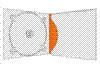
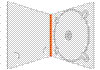
 Single Fold Digipacks

Digipack B
These single fold digipacks are what we would most likely use to promote an up and coming band who were releasing their first album. A single fold digipack would be sufficient to place a disks worth of music inside, on most of these designs there is also enough space to place information on the band (either a booklet or leaflet) this is important as it also gives information about the band whose
 main objective is to promote themselves.
 A single fold digipack is also the 
Digipack C
Digipack D
cheapest to produce which is important to consider as new bands are likely to have a small budget to spend on production, it will also allow for the CD to be sold for a reasonable price to the consumer which increases their chance of impulse buying to see whether the band are any good.


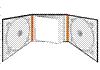
Multi- Fold Digipacks 

Alternatively we may choose to spend more of our 
budget on the digipack production, in which case we may
Digipack E
decide to produce a multi- fold digipack which looks more impressive than the single fold and presents the band with greater professionalism. 
Digipack F
 As there is space for 2 CDs we may choose to include special features such as other songs or the music video 
with deleted features, this would also give the 
CD a USP with its special features against

buying the track online.
Digipack G
 A multi- fold digipack also allows for better
 presentation of the bands information such
Digipack H
 as with digipack E which incorporates a small book in the centre of the pack and digipack F which allows you to place small 'free-bees' inside such as stickers 
and badges (these items would also help promote the band).
Digipack I
As there are more folds there will also be more panels of the digipack which would allow us to place more images of the band on to the pack, this would help promote the bands image (which is important for a boy band) to a greater extent than the single fold digipack.


Text Designs  

Text A
Our inspiration behind the album font was simplicity. We felt this represented the village musicians in both their songs and their appearance as a group. We felt that with an album cover, sometimes less can be more especially when trying to inform your consumers about a new band. I have created some basic font designs which may help with inspiration to design our actual
Text B
album title. Texts C and D are very natural in appearance with
the theme of mud and carved wood respectively. Where as on the
other hand Texts A and B while still simple are a bit more animated
with inspiration from old fashioned story books and comics.
Text C
Each of these fonts would allow us to market the album in a different way. For example... Text B could allow us to design a comic book style image of the band on the album cover, the
theme could continue throughout the album on to the CD design
Text D
and the information booklet.


Brand Identity And Album Covers

Album 1
We have included some images of previous album covers
along with images we felt most suited the identity of the band
and would be well suited on a new album or on a promotional advertisement. Album 1 and 3 are examples of past album covers
which are very similar to our simplistic text designs, both of which contain the logo of a bird in a circle (it is important that we place this logo in a prominent lace on our album as this is a large part of the brand identity). The images on Album 2 and 3 represent the band in very different lights. Album 2 represents the band as energetic and youthful- something which may have greater appeal 
to our target audience of the 13- 21 year old market. Album 4 however portrays the band as a serious and mature band which if used as a album cover may appeal to the older demographic 

Album 2
who are interested in listening to new up and coming bands.
Obviously these images were taken by someone who had ideas that were different to ours.If we were wanting to use an image of the band for our album cover, we would use images such as these for inspiration, however ultimately, we would ask to have a new photo shoot where we could use our own creative ideas to portray the band. However as I have stated above the last two album covers did not contain images of the band and therefore we may choose to follow this theme by using a image such as the logo or maybe

even an image which relates to the album name or inter textual
links with the lyrics 

Album 4
Album 3

Music Video Survey Responses (JONNY)


Our Survey was created on surveymonkey.com and was shared via social media (facebook and twitter) among our friends. We had 25 responses with a variance in information. We have broken this info down and have represented it via graphical form. The responses are as follows….
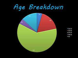


Q1. How old are you?
We used this question to determine how many of the participants were in our target market 13-21. 83% of respondents were in our target market, the most popular age being 17- 19, this was probably due to the fact that the majority of our friends are this age. Although we took in to account all responses, we paid particular attention to those that were in our target market.

Q2. What is your gender?
This question helped us compare the differentiation between the demands of the male and female market. Our target market is aimed at both, but we are aware that they may have contrasting opinions or demands for a music video. We had a good response from both male and female which was important! We had a larger male response, once again most probably down to a larger percentage of male friends on our social networks.  


Q3.In an average month how many music videos are you likely to watch?
This question began our analysis of our target audience’s perception of music video. In this question we hoped to measure the importance of music video in a person’s life. This was one of the hardest questions to analyse as we had such a mix of answers. Something that the chart does not show is that the majority of those that stated they watched a lot of music videos were in the younger demographic. We have interoperated this by considering that watching music videos is a past time such as, playing computer games and surfing the web. The older people get, the less time they have to spend on these activities.


Q4.Where are you most likely to watch a music video?
From our previous research, we were aware that there were many places where people can consume music videos. We wanted to look at what was most popular. Are questionnaire showed us that over 50% watch videos online on websites such as YouTube. Following closely behind were music channels such as MTV with just over 30% stating that they would prefer to watch them on there.


Q5.  When do you watch music videos?
Again this question helped us tap in to the market for music videos, letting us understand popular times in the day where people would watch them. The overwhelming majority of participants stated that they would watch music videos at home after school (possibly as a past time). There was also a small majority that stated that they watched music videos at the gym. Music videos are often consumed in a gym as channels such as MTV are frequently played.


Q6.  What do you expect from a music video?
This question started to look at our target markets expectations from a music video. Again opinions were very varied and were difficult to analyse. What we have concluded is that it is important to include a variety of music video genres to our video in order to gain a larger section of the market.


Q7. What are your views on boy bands in general?
This question poked fun at the variance of opinions on boy bands but was also used to help us analyse how easy it would be to promote ‘The Village Musicians’ if we chose their song for our music video. The majority of our respondents did not mind boy bands in different variances.


Q8. What genre of music video do you like?
This question linked with that of 6, allowed us to identify what style of music video would best suit our target audience. The two strong favourites were performance and narrative, we are likely to include both of these in our music video!    


Using Survey Monkey

This was the first time that I used survey monkey. Similar to other programs it required us to set up a free account which was reasonably simple. What was very impressive were the many formats of questionnaire that you could create on the program (open questions, closed questions etc..). The program also suggested better ways of expressing the question. Once we created the questionaire, it provided us with a link that we could share in order to have people answer our questions.  
 
Once we had enough respondents, the website allowed us to analyse the information. It gave us the option to see our results in graphical forms if we upgraded but we decided against this and instead created the graphs ourselves on excel. Overall I feel that this program is one of the best I have used in terms of practicality and the sheer number of things it was capable of doing. This is a tool that may be useful in the future, either at university or in a future job.


Font analysis: DVD and magazine ad (Josh)

Most record labels have a particular font that is associated with them as well as individual bands having this as well. We want to find out how much the font really says about the band/product being sold. We don't we to misguide the audience about what our music genre is and what our product is by simply having the wrong font for what we are sell (The Village Musicians). This is why we are going to look at a couple of different products including DVD covers from bands as well as a magazine advert.

Firstly I am going to look at the font that is used on a DVD cover for the one direction tour DVD up all night. This DVD has three different fonts used one for the band name, another for the tour name and finally for what is actually on the DVD. The main writing on the DVD is the band name which is written in a much larger and more bold font than the rest of the text on the page. This helps to draw the attention to the name of the band and means that people that are going to buy the product are easiy able to find it. This means that we should have any writing of the band name large so that people have there attention drawn to it more easily than they would if it was the same size as the name of the tour. The name of the tour is in white making it easy to see on the black background and it also matches the colour of the band name. The final text on the page which says "The live tour" is in capitals this is so that people are fully aware that the tour was filmed in front of a live stadium audience and hasn't had anything changed on it this is important for the band so that they are able to maintain a positive image of being honest with fans.

This here is an example of a band advertisng a new album that they are about to release. Once again there are a number of different font types. This once again has the bands name written in the boldest and largest font on the page and shows that this is seen as the most important part of any publication that is advertising a band. This however has the album name in reasonablly large writting as this makes it easier for the audience know what they are looking for on itunes or other similar music websites. This is in a gothic font which fits with the genre of music that the band produces. The text at the bottom of the page is much smaller but does stick with the colour scheme that would be expected by a band of this genre.


To conclude the font that a text is written in is quite important but the most important is that the band name is the largest writing on the page so that the target audience is able to find the music when they go to a shop to buy it.


Record Labels


I have selected two different record labels to look at for my this post. I have chosen to look at syco and Virgin records. The reason that I have chosen these as they are both founded by individuals that are very well known within the UK. Both Simon Cowell (syco) and Richard Branson(virgin records) also have various other lines of work.


Virgin records have a number of different people signed to them with one of the biggest most popular names to have been signed to them being the spice girls. Others the Gorrilaz and the Rolling Stones. This particular record label seems to be aimed at bringing developing artists through as well as having some that are already very successful. I like that this record label doesn't seem to have a great deal of bands therefore it is able to focus on them all more so than labels like sony that have 100's or even 1000's of artists and therefore may not be able to put as much effort into them all. This is one reason for why Sony own many smaller labels in order to make sure that all of the artists still get enough attention so that the music doesn't begin to suffer.

As for Syco they tend to take on artists from talent show that Simon Cowell, the founder, is part of. Recent artists include Little mix and One direction. I like that the label takes these people on to ensure that they do get a chance and that the show finishing isn't the end of the road for them. However they have a reputation of dropping artists quickly if they begin to fail and dont have a good spell.

Succesful Bands Similar To Village (Jonny)

Two Door Cinema Club is a three-piece "indie rock" band from Bangor and Donaghadee, County Down, Northern Ireland. The band was formed in 2007 by Sam Halliday (lead guitar, backing vocals), Alex Trimble (vocals, rhythm guitar, beats, synths) and Kevin Baird (bass, backing vocals).
The band has received mixed reviews since releasing their first album ‘Tourist History’ in march 2010. Some of their successes include being selected for the Choice Music Prize for "Irish Album of the Year" (2010) and being placed at number 1 in the Irish album charts in September 2012. 
The Village Musicians and Two Door Cinema Club are very similar. Although Village play more of a pop style of music whilst TDCC play more rocky both bands represent themselves as Indie. The formations of both bands are also very similar with 3 main members of Village who all play similar instruments and vocals.
I believe that Two Door Cinema Club’s success came from their individuality and style. Although the band are not world known they have received a small cult following of those that relate to the bands style of music and quirkyness. I think that Villages style of music is much more universal across ages, genders and socio economic statuses. However the way they present themselves is not as original as say ‘TDCC’ because of this I think they may find it hard to accumulate mass groups of fans due to being a standard indie pop group.
 

Blogger news

Sample text

Blogroll

About

Sample Text