Construction of Stop Motion (JOSH)
Our music video has stop motion at the begining of it as this was the best and most creative way that we could think of to introduce who the band were and the name of the song which we felt was important with them being unsigned. This was also a requirement that the band wanted us to include when we asked for permission to use the song in the creating of a music video.
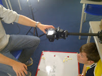
 We did a trial run using only the classroom lights and took the photos without a tripod. Doing this meant that we realised that we needed to use proper lights as well as a tirpod to get the effect that we wanted and to ensure that it was of the best quality possible.
From the outset we knew that this was a process that would take a long time in order for us to get the effect that we intended the stop motion to create. In total we estimate that we took around about 400 photos over the course of 3 hours. It was a process that was well worth the time as the end product does look superb.
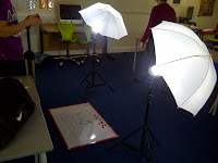 In order to make sure that all of the photos were in the same light conditions we used the lights that you can see in the picture. This was very successful as it meant that all of the images were taken in the same light and thus meaning that there weren't continuity errors.
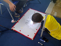
 We used a large white board and put it on the floor so that it was flat and we could make sure that it was in the same position for every photo that we took. The reason that we chose a whiteboard was because it meant that we could rub bits of the image out and change the position of it to create the impression that the image was moving.
 We did a trial run using only the classroom lights and took the photos without a tripod. Doing this meant that we realised that we needed to use proper lights as well as a tirpod to get the effect that we wanted and to ensure that it was of the best quality possible.
From the outset we knew that this was a process that would take a long time in order for us to get the effect that we intended the stop motion to create. In total we estimate that we took around about 400 photos over the course of 3 hours. It was a process that was well worth the time as the end product does look superb.
 In order to make sure that all of the photos were in the same light conditions we used the lights that you can see in the picture. This was very successful as it meant that all of the images were taken in the same light and thus meaning that there weren't continuity errors.
 We used a large white board and put it on the floor so that it was flat and we could make sure that it was in the same position for every photo that we took. The reason that we chose a whiteboard was because it meant that we could rub bits of the image out and change the position of it to create the impression that the image was moving.
Audience Feedback From 1st Draft Of Music Video (JONNY)

Improvement 1- Lip Synching
The majority of video currently is 2 seconds in front of the song. This makes any singing in the video look very silly! It would be easy to fix this problem, if the whole of the video was 2 seconds in front. However as it is only part of the video we will have to find a way of only shifting that part, whilst keeping the rest in the same location. I feel that this will be the hardest challenge and will be difficult to fix.
Improvement 2- Dream Sequence
A lot of feedback talked about how the audience were unaware that one of our sequences was intended to be a dream. I have started attempts at improving this by finding a fce tutorial explaining how to make a filtered dream sequence (View Here). I hope to have this fixed by the end of the week.
Improvement 3- Dream Bubble
This should be the easiest problem to fix, but I am having a real problem with it! We have a dream bubble in front of a white background. The original colour of the dream bubble is white, but in the video it turns purple. This was also noted in the feedback as it makes the quality of the video very poor. I am not sure why this has happened and have tried to change this. I think I will need to conduct some research to establish what the problem is and how I can go about fixing it.
Market Research Album Covers (JONNY)


|
|
EXAMPLE
‘The evolution of man’
|
MAROON
5
‘Overexposed’
|
ONE
DIRECTION
‘Take me home’
|
|
Images
|
The
albums show a person holding a picture of the artist example when he was
young over an image of a crowd at a festival. The style is very retro and has
a ‘home made’ feel to it. The image on the album is creative as it indirectly
relates to the title ‘evolution of man’ as in a way the image shows the ‘evolution
of example’.
|
The
album comprises of a number of hand drawn unusual images with a pink/ purple
colour scheme. The images and the colours are bright and so attract the eye
but do not tell a story or have any other purpose on the album cover.
|
The
band is clearly represented in the album cover. The fact that they are all
round a telephone box gives a British representation in international
markets.
|
|
Brand Identity
|
The
iconic Example logo is placed on the top left of the album. This makes it
easily identifiable for his fans, however it is not as easy to identify for
consumers browsing in a shop.
|
The
band name is placed along the middle of the album, however does not stand out
as much as the same colours are used. The name of the album is crushed along
the bottom of the album. Although the album cover is unusual it relates to
their other albums in terms of design.
|
The
brand identity is extremely strong with all of the band being placed in the
image. The name of the band and album name are clearly presented. This makes
the band easy to identify for consumers, even those who are not as familiar
with the band.
|
|
Presentation of artist/ band
|
The
album presents Example through his younger self. This portrays a sense of
innocence. There is also the idea of achievement, that when the picture was
taken he dreamt of being famous and the fact that it is placed over a massive
crowd means that he has achieved this.
|
There
are no images of the band, however arguably they are famous enough to get
away with this. The creative album image may be used to indicate their
creative music style.
|
The
fact that they are jumping and climbing on the album cover connotes
youthfulness, energy and fun. The fact that is a sunny day means that the
songs are likely to be happy. These are all things that we relate to boy
bands, especially One Direction.
|
|
Other
information
|
This
album cover is effective however suits artists/ bands that are already
famous. Our album will need to promote ‘The Village Musicians’.
|
Although
I like the design of the album as it would stand out amongst all those other
CDs in HMV. It would be expensive and time consuming to produce the images.
Similar to the Example album, it would not promote our band.
|
In
my opinion the album cover is too cheesy. However in terms of concept and
promotion of the band, something similar to this would be good for ‘TVM’.
However it would be important to make sure that we didn’t alienate the male
market.
|
Digipak Market Research In HMV (JONNY)
After being given our brief to create an album cover for ‘The
Village Musicians’, I sought to conduct some market research in one of the UK’s
largest music retailers ‘HMV’.
 The first thing that struck me when walking in to the store
were the vast amount of different sections ranging from band t-shirts to tablet
computers (their product range is extremely diverse!) Looking around the shop,
to the left a large purple sign caught my eye ‘Chart’ with a music sign next to it. I decided that
this would be a good place to start!
The first thing that struck me when walking in to the store
were the vast amount of different sections ranging from band t-shirts to tablet
computers (their product range is extremely diverse!) Looking around the shop,
to the left a large purple sign caught my eye ‘Chart’ with a music sign next to it. I decided that
this would be a good place to start! The chart music was aesthetically well displayed with lines of the albums all in unison. In my opinion, this allowed the artwork of the album to stand out far greater than if there had just been one album per artist.
  An album that stood out for me was the new One Direction album which had different visual versions of the album, with the image of a band member on each.
 This gives the consumer more choice (or dare I say, for real fans, the opportunity to buy all 4!) I found this interesting due to the fact that we are also promoting a boy band, although arguably with much greater musical talent than 1D.

Moving on from the chart music, the main section of the store is devoted to what seems like every album ever created, literally thousands! I payed specific attention to the Rock and Pop section as I felt that was the genre our song best fit in to. As you can see from the pictures, its not easy for an album to stand out when there are this many. The Rock and Pop section seemed to go on for ages!


The albums are firstly categorized by music genre e.g Rock and Pop. They are then sub categorized by alphabetical order of the album name. There are also other sections such as 'greatest hits' which contain compilation albums with a selection of an artists/ bands greatest hits. This methodology makes it very easy for browsers to allocate the album they may be interested in purchasing.
 Along with looking at album designs and artwork, I spent some time analyzing the market for music DVDs This is a much smaller market with the picture to the right showing the whole of HMVs selection. I wanted to compare different styles of music DVD such as; performances, documentaries and compilations.
 Once again coming back to One Direction. I have found 2 examples of performance DVDs. The model of these specific DVDs is to film the band during their live concerts, possibly add some extra footage such as back stage interviews and package it all in to a DVD. A perfect item for fans who were unable to get tickets for the concert- the next best thing!
Alternatively I found this hybrid music DVD which consisted of a collection of Elvis Presley's greatest performances. This product was aimed more as a collectors item with a high quality box to encase the DVD with a small book including information on Elvis also included!

This music DVD is a documentary looking at the history of Rap music and its development throughout the years. It is called 'something from nothing the art of rap'. The purpose of this DVD is to educate the viewer about the music genre, teaching them to have a greater appreciation of the song. The video is directed by ICE- T who is a well known musician in this field of music.


 After conducting my market research I stopped off at the listening post to see what styles of music were being played. Similar to the shop the selection of songs available to have a brief listen to (30 seconds) were in its thousands. These were all in a database with a search toolbar at the top of the screen, you could search by song name, song artist or even by genre. While I was very impressed by the vast amount of songs available, it was disappointing to see that 'The Village Musicians' were not one of them!
From my market research I have conducted that CDs are much more viable then music DVDs. I believe this is due to the increased usage a CD can have over a DVD. A CD can be listened to passively (whilst driving a car, doing homework etc) a DVD needs your full attention. It is clear to me that a lot of effort goes in to designing the artwork for an album cover as when albums are faced with such competition against hundreds of other albums as shown in my images above and that many different tactics are used to do this (bright colors quirkiness of the cover, no images/ no words). These all give USPs to the album covers, and increase the chances of a browser picking the album up! Having spent time in HMV my opinion is that the CD sector of their market is focused at the older demographic who would still rather listen to a CD then download the song online. This opinion was backed up having during my time viewed the majority of CD browsers as 40+. This market research will help me develop my own ideas for an album cover representing 'The Village Musicians',
Editing Schedule (JONNY)
 I created this editing schedule at the beginning of November after we had completed all of the filming and had uploaded the footage on to the computer. I coordinated our availability through both of our school time tables. I then created a schedule on Excel placing hourly slots in line with our lessons at school.
Mood Board Representing Our Music Video (Jonny)
This is a Glog that I created, which gives a brief representation of our music video through words and images. It represents ideas that we had and implemented in our music video. This mood board was created on an online software called Glogster EDU.


I have had a Glogster account for a while now as this was one of the technology's that I used for my AS portfolio, and so was familiar with the set up of the software. Glogster edu allows you to set up a simple account which is free, however you can upgrade to a premium account paying a monthly fee. I used the free version which allows you to import images, videos and music to create a mood board which they call a 'Glog'. It is a very simple product to use and is quick to use if you already have the images saved. Another great benefit is that similar to other online programs I have used, you are able to embed your final product on to your blog. which makes it look that bit more professional!
Subscribe to:
Comments (Atom)


